Reading the Sankey
ShopeeTikTok
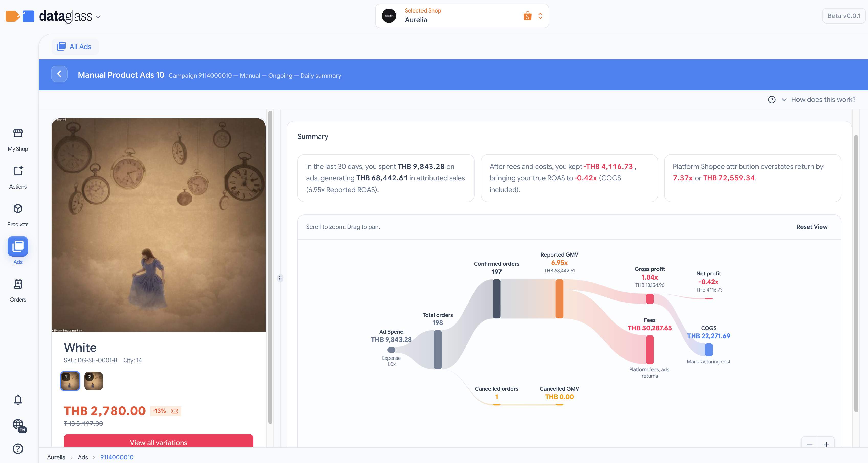
Understand how ad spend flows through platform fees, cancelled orders, and COGS to reveal True Profit.
The Sankey chart is a flow diagram that shows where your ad spend goes. It traces every dollar from ad spend → orders → platform GMV → actual profit, revealing the hidden costs that platform-reported ROAS ignores.
How to read it
- Ad Spend (left) — Your total ad spend for the campaign; the starting point of the flow.
- Orders (second column) — Orders attributed to ads; splits into actual orders (top) and cancelled orders (bottom, amber).
- Platform GMV — Total GMV reported by the platform, but includes duplicates and returns.
- Actual GMV (top flow) — Orders that actually completed; platform ROAS is calculated here (spend ÷ GMV).
- Overcount deduction (bottom flow, amber) — Cancelled and returned orders that inflate platform GMV.
- Profit calculation — Actual GMV minus platform fees and shipping cost.
- COGS deduction (if enabled) — Subtract product cost-of-goods-sold (blue or purple if inferred).
- Final Profit (right) — Net profit attributable to the ad; divide by spend to get True ROAS.
Why this matters
- Platform ROAS vs. True ROAS gap — The chart shows why platform ROAS can claim 4× while you're barely breaking even.
- Cancellation impact — Amber flow shows how many orders never shipped; high cancellations kill profitability.
- COGS visibility — If COGS is inferred (purple), add your real product costs to refine the profit number.
Toggle the COGS calculator on or off in the KPI cards above the chart. Inferred COGS appears in purple; verified costs are blue.